Lucid Journal
- Editorial Design
- Professional work, University of California, Irvine
- 2020—present
Lucid was founded in 2019 at the University of California, Irvine, and published its first issue a few months after the COVID lockdown began. Our original mission was to amplify the voices of first-generation students, but since the changes wrought on education by COVID, Lucid’s ambitions have grown. As co-founder Dr. Rachael Collins puts it, Lucid is now “dedicated to amplifying the work of everyone working in higher education to dismantle systems of oppression and create a liberatory future for education,” with a focus on modeling a new pedagogy of writing that centers student experience and expression rather than inducting students into an “impersonal” institutional style.
 (drawing by Erik Perez)
Lucid was originally published as a PDF flipbook on Issuu but has since become a website.
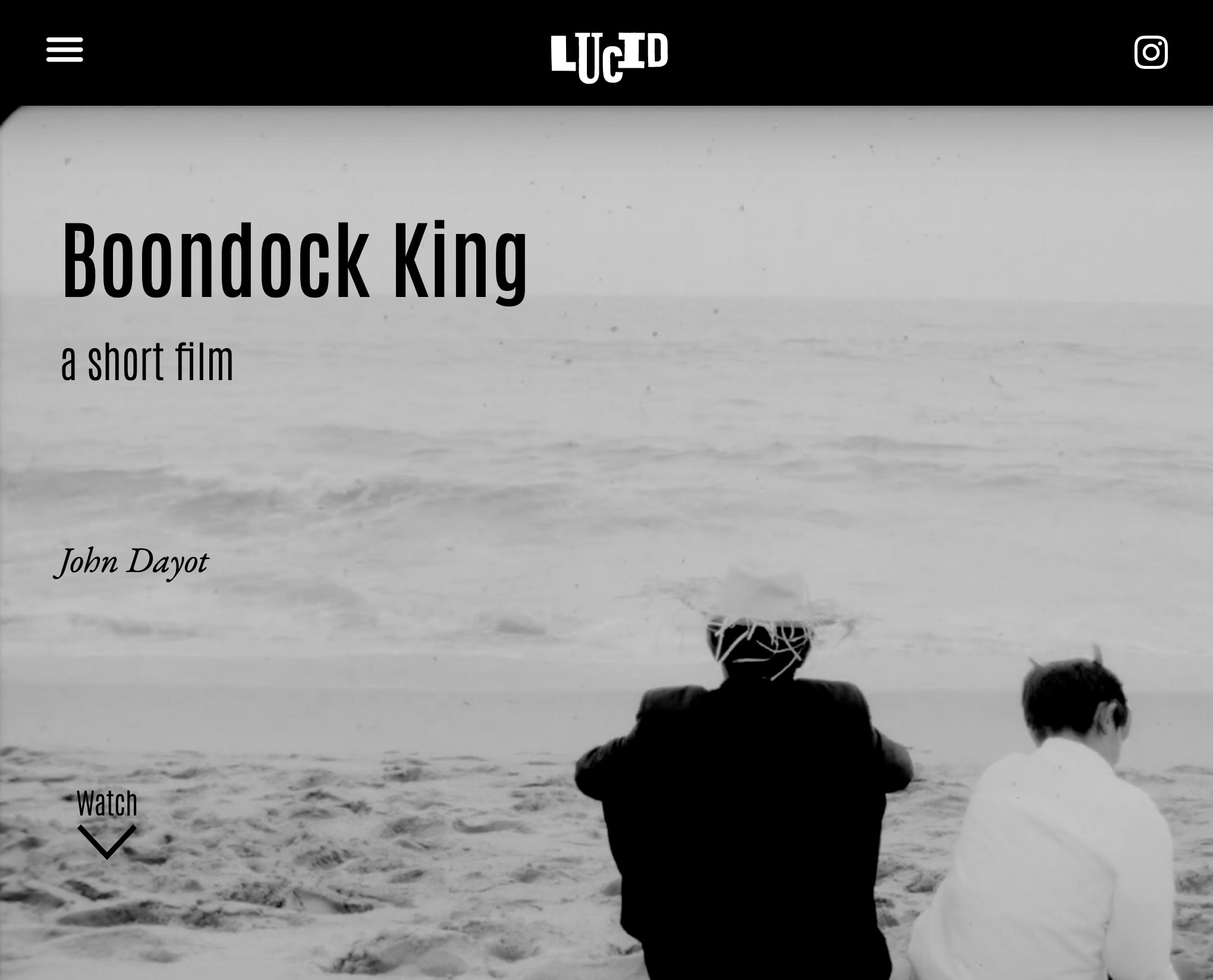
Issue #1: Borders & Belonging
Lucid began as a showcase for first-generation student work in UC Irvine’s composition program. Co-founder Dr. Rachael Collins was trying some innovative stuff in her classes and the work coming out of them was special, so she wanted to show other teachers the results of these teaching methods and to promote and advocate for her students, most of whom were the first in their families to go to college and didn’t get a lot of support from the university.
The journal developed conceptual ambitions beyond just publishing good student work. Many students wrote about their status as outsiders or newcomers to higher education, or to the United States, or to both, and this mattered for the design; we wanted each piece to have its own visual “voice” while maintaining a consistent design language across the issue, and we wanted the designs to celebrate each piece and each writer. The issue needed to be colorful and playful and suggestive of a vibrant world full of varied experience, and the layout of each piece needed to be evidence of a loving, handmade attention to its contents.
To organize this variety, we used some beautiful drawings by our cover artist Mayra Sierra as a unifying motif. Her work was youthful and playful but with a utopian-futurist vibe that exactly matched our vision. In her line drawings—I started thinking of them as “doodle futurism”—past, present and possible realities all crowded into one lively imaginative space . . . and if that didn’t sum up what we wanted Lucid to be, what would? Mayra’s drawings became a recurring motif that spoke to each writer’s work without flattening the individuality of their voices.


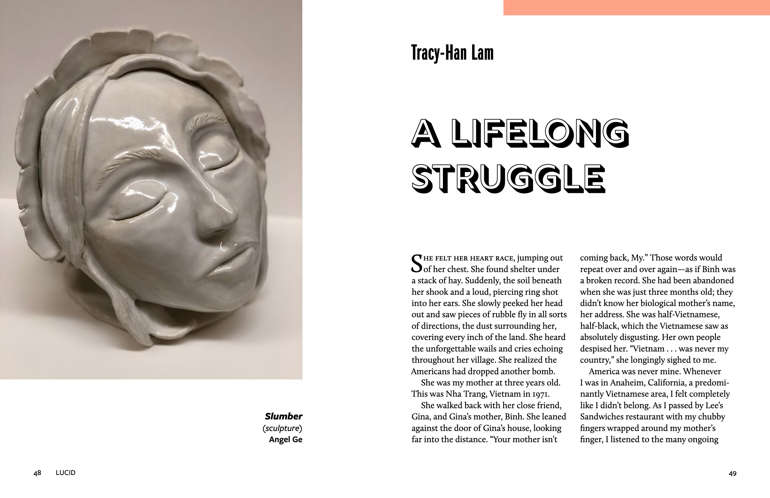
Tracy Lam’s “A Lifelong Struggle”
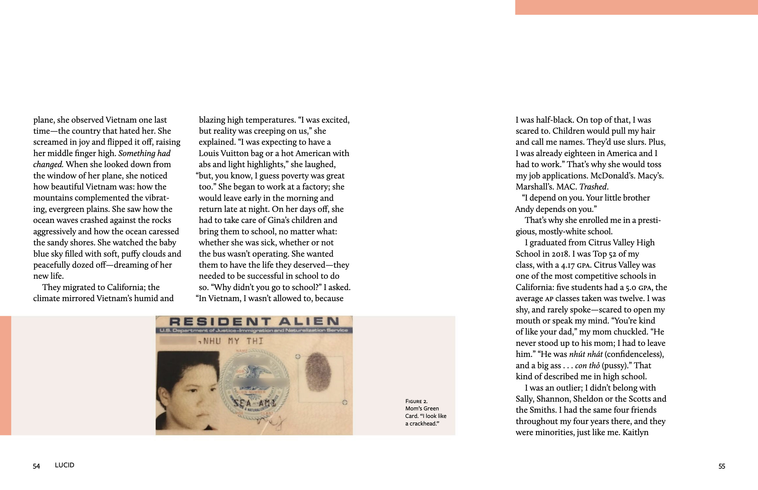
Tracy Lam’s piece is an ambitious, genre-experimental piece that called for some idiosyncratic design solutions. For instance, it uses photographs and their captions in narratively inventive ways, and I wanted to highlight that inventiveness but still play along with the performance of journalistic detachment that made the captions so funny.
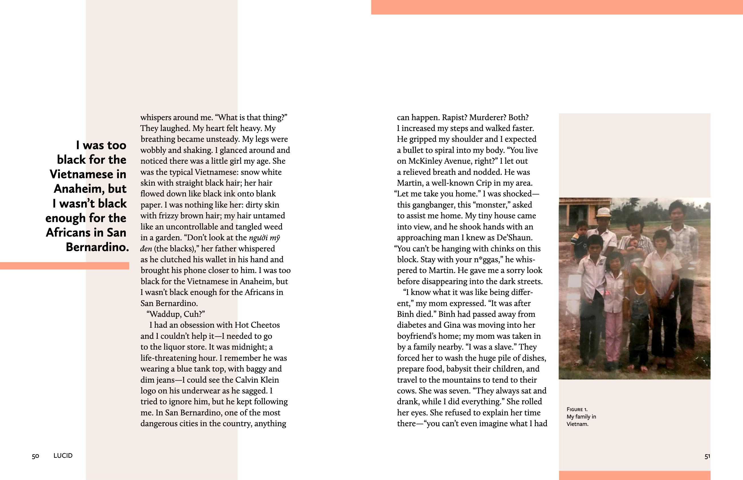
There were also several moments when the text took an unusual form, for instance when a poem suddenly intervenes, or when Tracy inserts a letter she wrote to her brother or a screenshotted text message to her roommate. There was no way to just drop this material into a grid and call it a day.
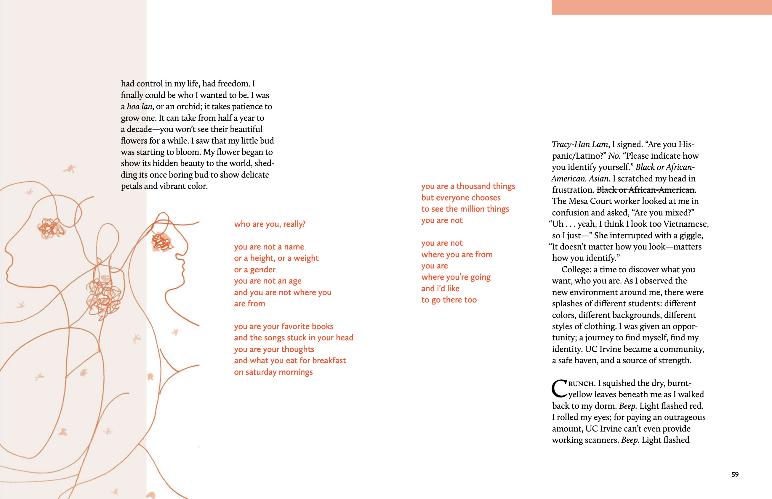
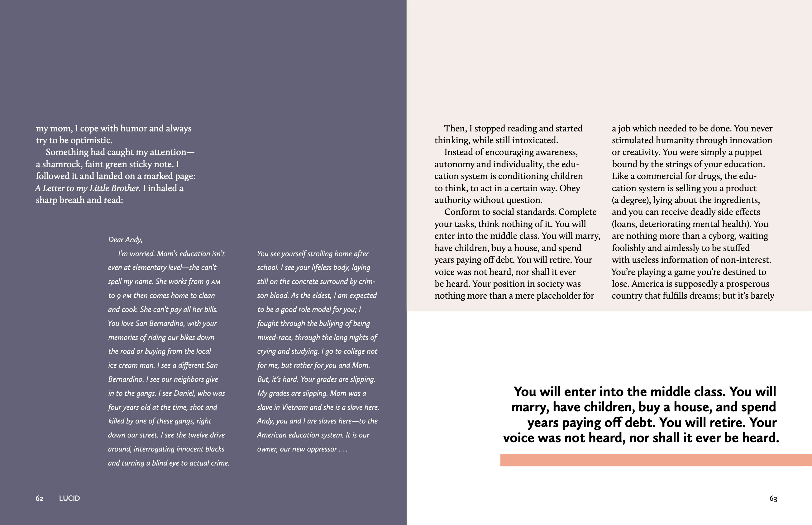

The poem forms a pivot point in the piece, so visually I treated it that way, as a bridge reaching across from the first half of the essay to the second. I used the letter in a similar way. In both cases, I made these generic departures typographically disinct but related to the main text, and spatially set off but still clearly positioned in the order of reading. I wanted them to feel like departures or interruptions, but not digressions—changes in pace and tone but not outside the flow of the narrative.
“Interview with Mariel Calva”
The piece submitted by Mariel Calva bore the marks of a college writing assignment more than the others, so we thought it would shine more if readers knew the details of that assignment. We framed the piece with an interview Mariel’s teacher conducted with her about the experiences behind her essay, an authoethnography centered on her Mexican mother’s largely untreated chronic migraines. We also asked Mariel to make some notes in the essay’s margins explaining her thoughts, identifying writing choices she might make differently now, and expanding on points she didn’t have the space to go into at the time. We laid out the essay with its original MLA formatting and Mariel’s amazing marginal notes alongside the interview and allowed each to elucidate the other:


This was the most overtly pedagogical piece in the issue, since it foregrounded the process and not just the results of a composition assignment. Before I started designing, I worried that the interview might come across as an attempt to control Mariel’s work too much, but in the final piece, even the pedagogical case-study aspect fell into the background and we were left with a portrait of a really impressive, thoughtful person who had a lot to say to the UC Irvine community, particularly to faculty and administrators who neither understand nor know how to ask where their students are coming from.
Issue #3: The Worldbuilding Project
Rachael stepped aside for issue #2, which was edited by co-founder Scott Lerner. When we returned for issue #3, Rachael had new ideas she wanted to try: instead of making a traditional journal with its emphasis on “literariness” and merit-determined exclusivity, this issue would be a purely descriptive assemblage of daily experience: interviews, audio field recordings, photographs, napkin drawings, written descriptions of things or places or events, autoethnographic research—anything that illuminated some corner of the student’s world. Rachael called it “the worldbuilding project.”
The task was to figure out how we would present all of this heterogeneous material—audio, video, images, text. Initially we considered setting the issue up as a tagged and searchable archive, not as a linearly organized publication; but we had to delay this idea until issue #4. In a PDF journal format with embedded media, the question became how we would realize the concept of “worldbuilding” through visual design. How would we build that world visually?
I wanted to make the whole issue feel like an interior or geographic space, so I hit on the idea of a graphic “horizon line” that would run from page to page. Later, I was drawn to maps and aerial photography. Both ideas survive in the final design, although the map motif took over as the theme of southern California geography emerged: how where the students are from shapes their identities, how they often feel they must disavow their place of origin to belong at school; one piece focused on a student’s grueling commute to Irvine from the South Bay of Los Angeles. The final designs for several pieces incorporate actual maps of the Los Angeles area to show visually how geography affects the students’ daily lives.


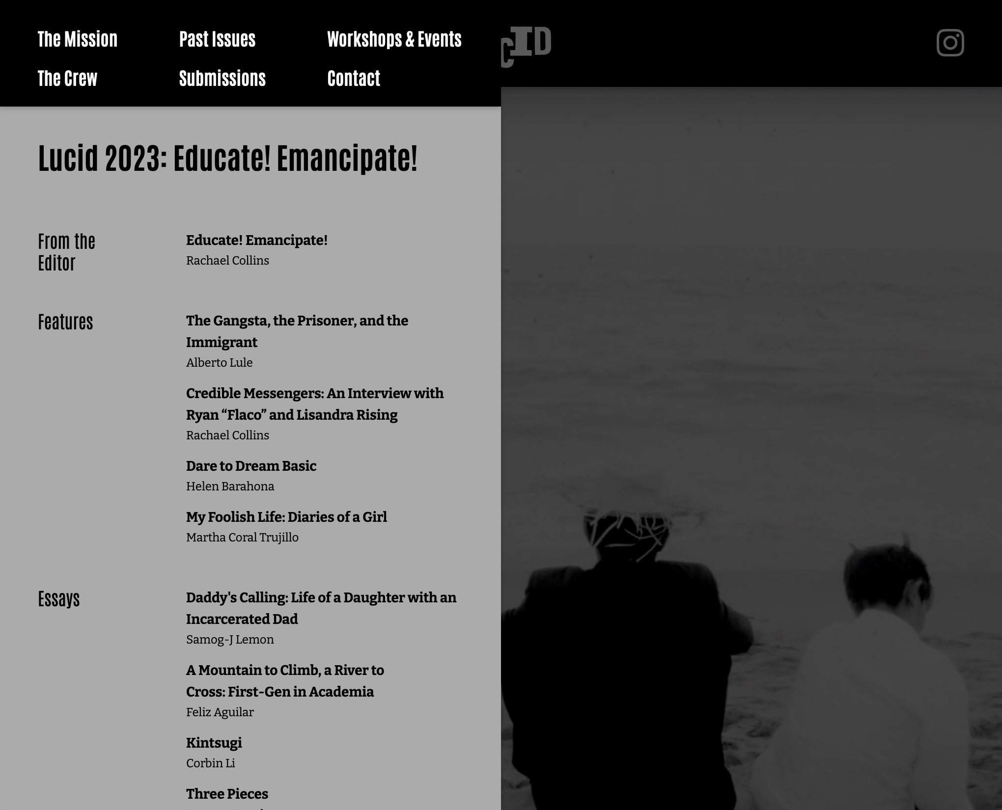
Issue #4: Educate! Emancipate!
The theme of our fourth issue was system-affected students, and for the first time we commissioned a few pieces—in this case, by formerly incarcerated graduate students. (Their campus organization, Underground Scholars, brought a lot of additional submissions to us.)
The format of the PDF journal had been limiting us for a while so we used issue #4 to transition to a proper website. Among other things, it would display much better on mobile devices, be more accessible to users looking for specific content (via tags), and allow us to to create more interconnections between pieces. I designed and built the site on Webflow, and we welcomed a few undergraduate design interns onto the team.
A principle of the journal’s design that remained central to its mission was the avoidance of uniformity; we still wanted each piece to have its own visual voice. The nature of the medium, however, made this more difficult. We did not want the pieces to feel like “content” dropped into a pre-built container, so in addition to the unique layout each piece received, we created color palettes that changed from piece to piece.

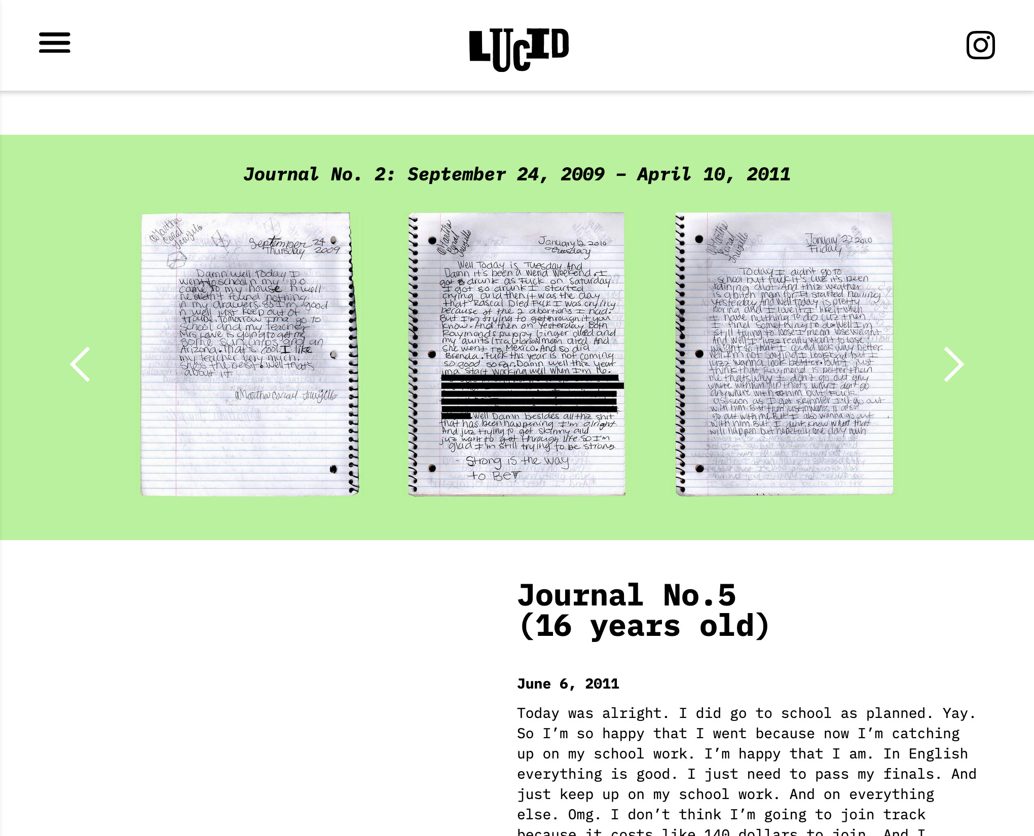
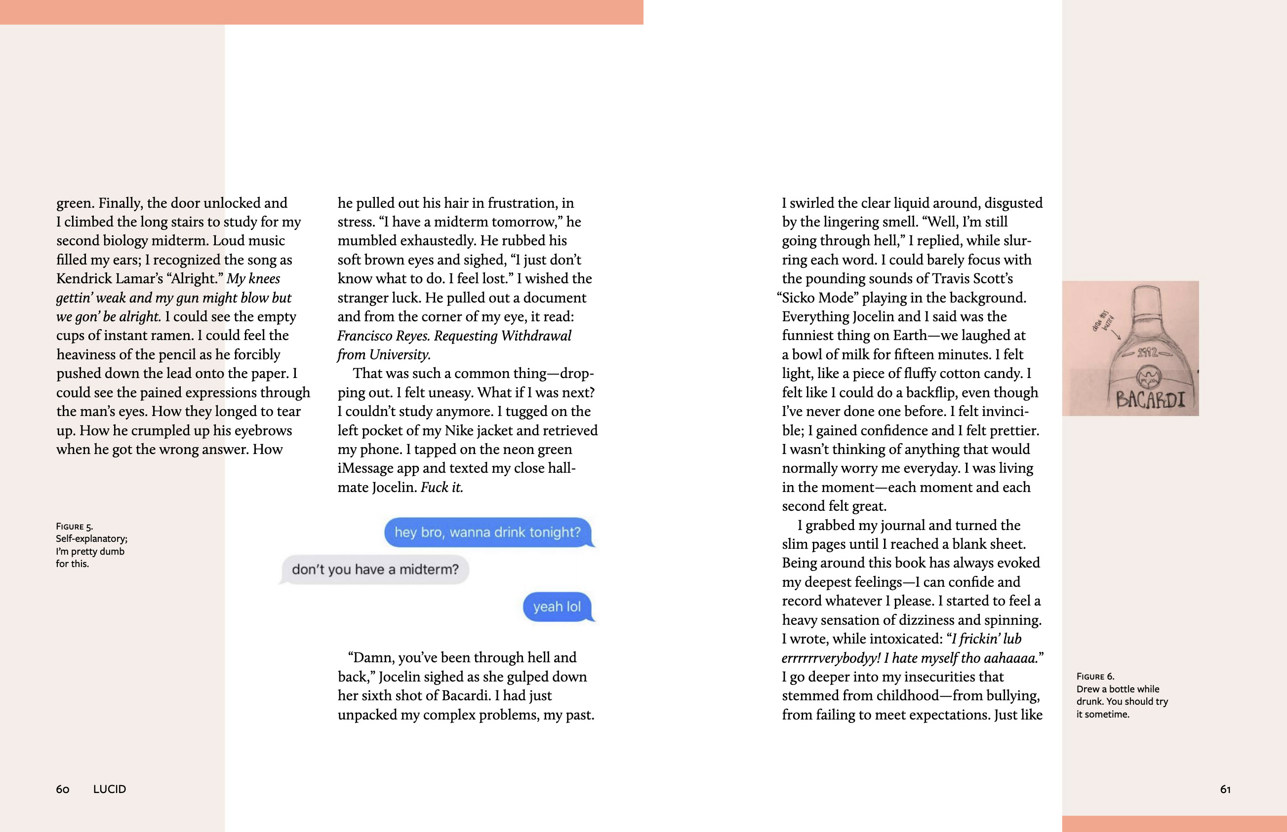
Martha Trujillo’s “My Foolish Life: Diaries of a Girl”
Martha Trujillo’s piece was a selected transcript of several years’ worth of journals she’d kept throughout middle and high school. We thought it important to convey the physicality of these journals and we wanted the design to suggest handmade-ness, but at the same time we didn’t want to create a false presence or intimacy. So rather than affecting a handmade quality in the design itself, for instance by setting the transcript in a handwriting font, we included high-res scans of the pages and typeset the transcript in a monospace font that suggested an exhibit of archival materials. (We even redacted some of the text and blacked out parts of the page images.) Some of the pages were displayed as a jumble, echoing the organization of the journals; others we made browsable as if in a microfiche viewer.