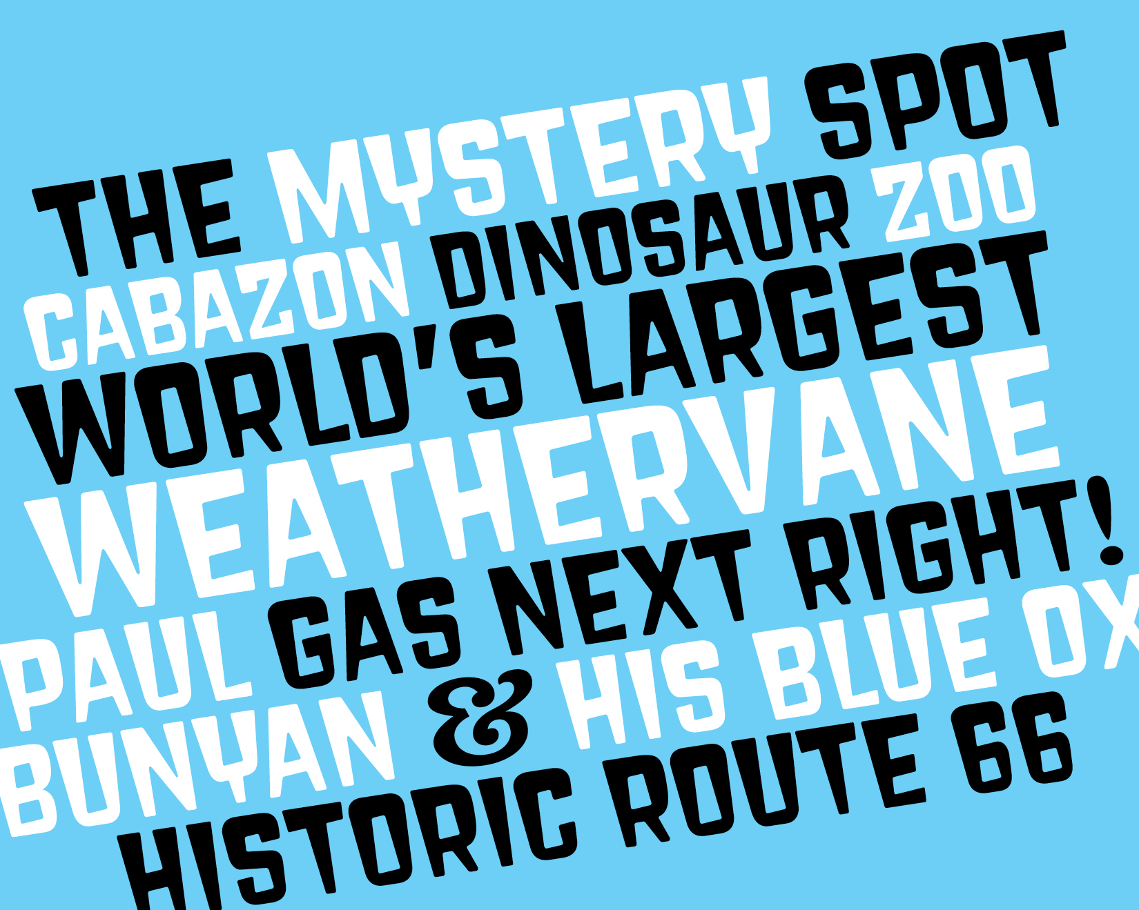
The Thing
- Type Design
- Personal work
- 2022
If you've ever driven within a hundred miles of Tuscon, Arizona, you have seen the contemporary descendents of an old handpainted billboard for "The Thing." What is it, you ask? Take exit 322 off I-10 and pay a dollar to find out. The new billboards aren't as cool as the old one on which I based this spooooooky display face.

(If anyone knows who painted this sign, drop me a line. One name I’ve run across is George Borum but I can’t confirm it.)


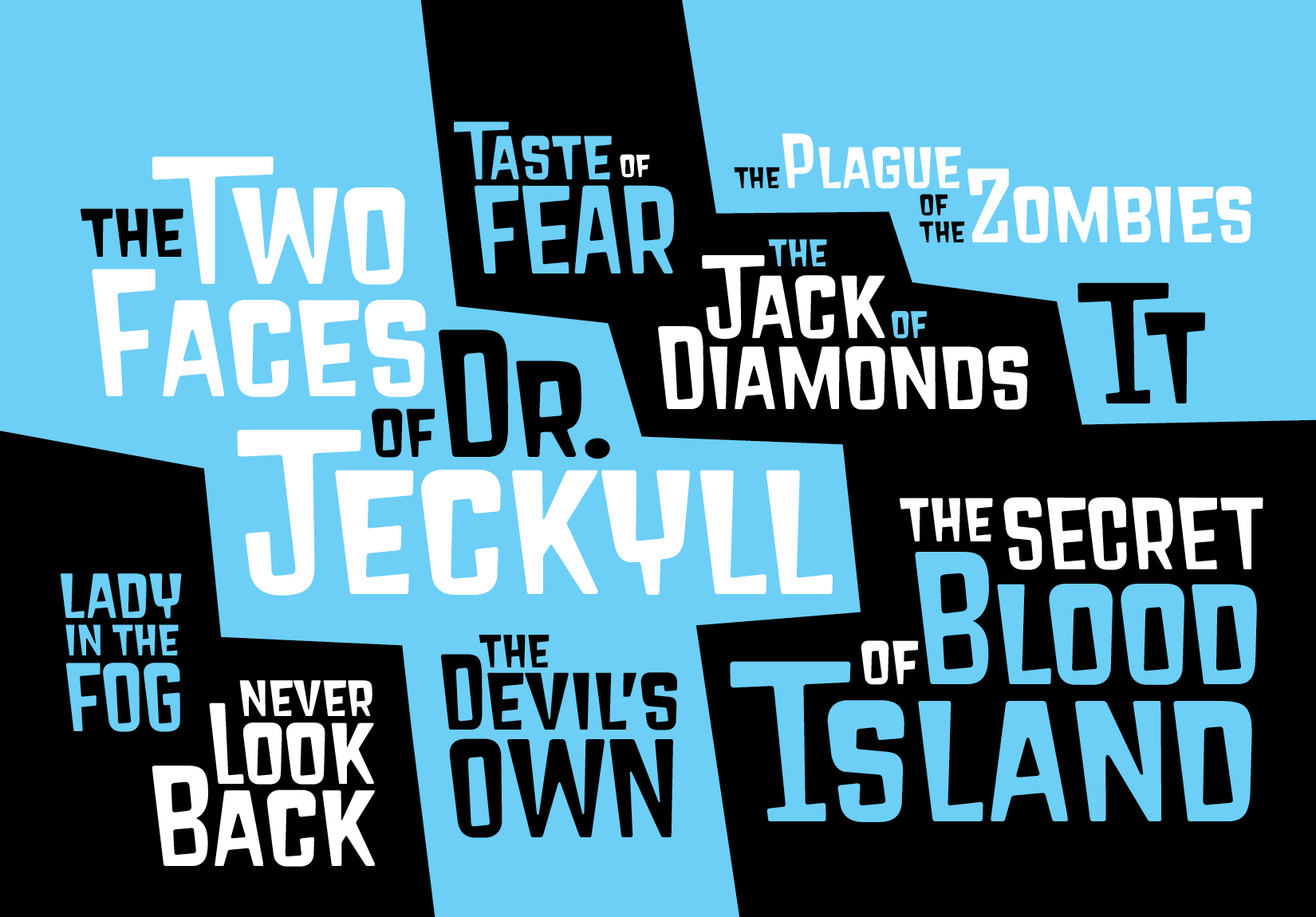

Supports 317 languages, believe it or not:

Process
The original letters, designed only in relation to each other, did not want to form an evenly spaceable system. I also wanted the letters to have their weight at the top and get lighter as they went down, and not every letter lends itself to this contrast model (especially N, which I redrew many times).

My solution was to create a grid based on O and H and fit the other letters to it. The grid keeps the weight in the right places and enables even spacing. To create that trapezoidal shape without introducing huge amounts of white space at the bottom, only the left side is slanted and the right side is nearly vertical (although the angles around it keep it from feeling upright).
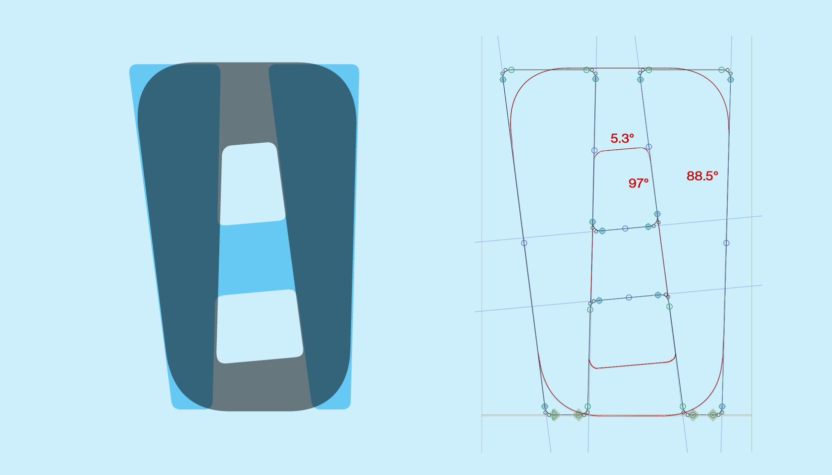

(Originally, I wasn’t going to distinguish the round from the straight letters, but the B looked so weird that I added some larger-radius curves. It changes the character of the typeface but in a good way, I think.)