Lucid Logotype
- Logo design
- Professional work, University of California, Irvine
- 2023
Logotype for the relaunch of Lucid Journal.
Lucid is devoted to education activism and the amplification of marginalized student voices, so we wanted a logo that evoked protest typography both past and present. We also wanted it to suggest heterogeneity and non-conformity.
Process
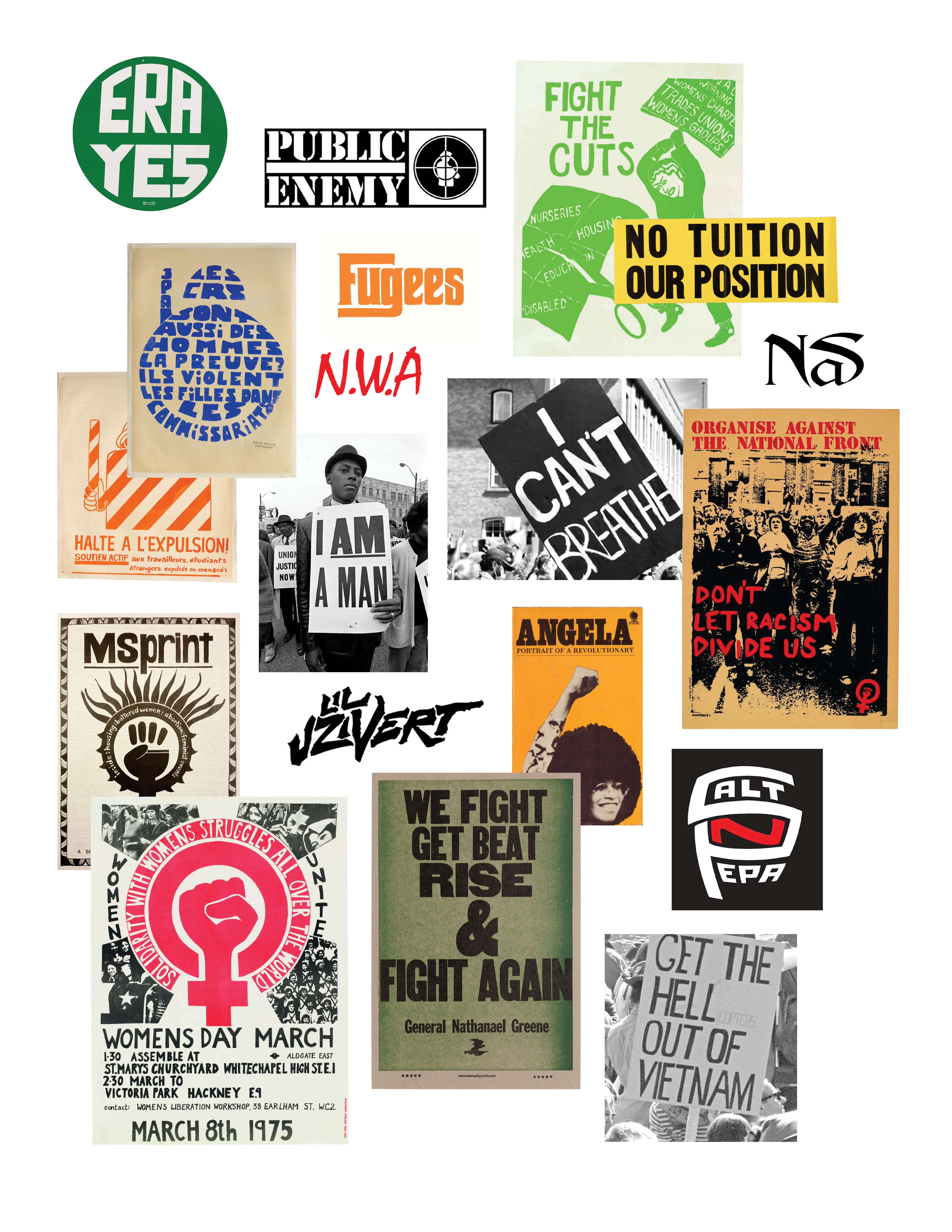
Our visual inspiration consisted mainly of: 1) hip hop logos, and 2) feminist, anti-racist and anti-war protest signs, posters, and publications. (We spent hours with Silas Munroe’s Strikethrough!: Typographic Messages of Protest.)
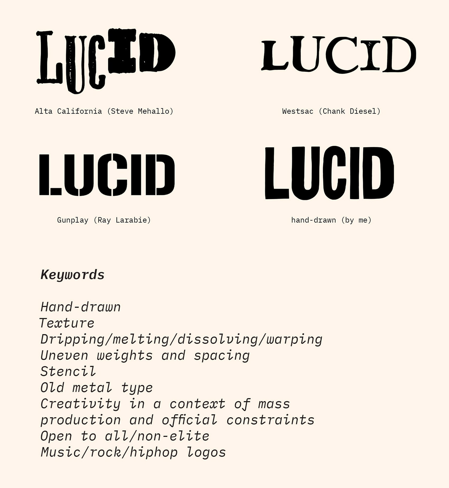
To get some initial ideas flowing, I made mockups using typefaces by other designers. I also drew a few of my own, by hand and digitally. We settled on four favorites, then generated a list of qualities and associations that drew us to the ones we’d chosen.
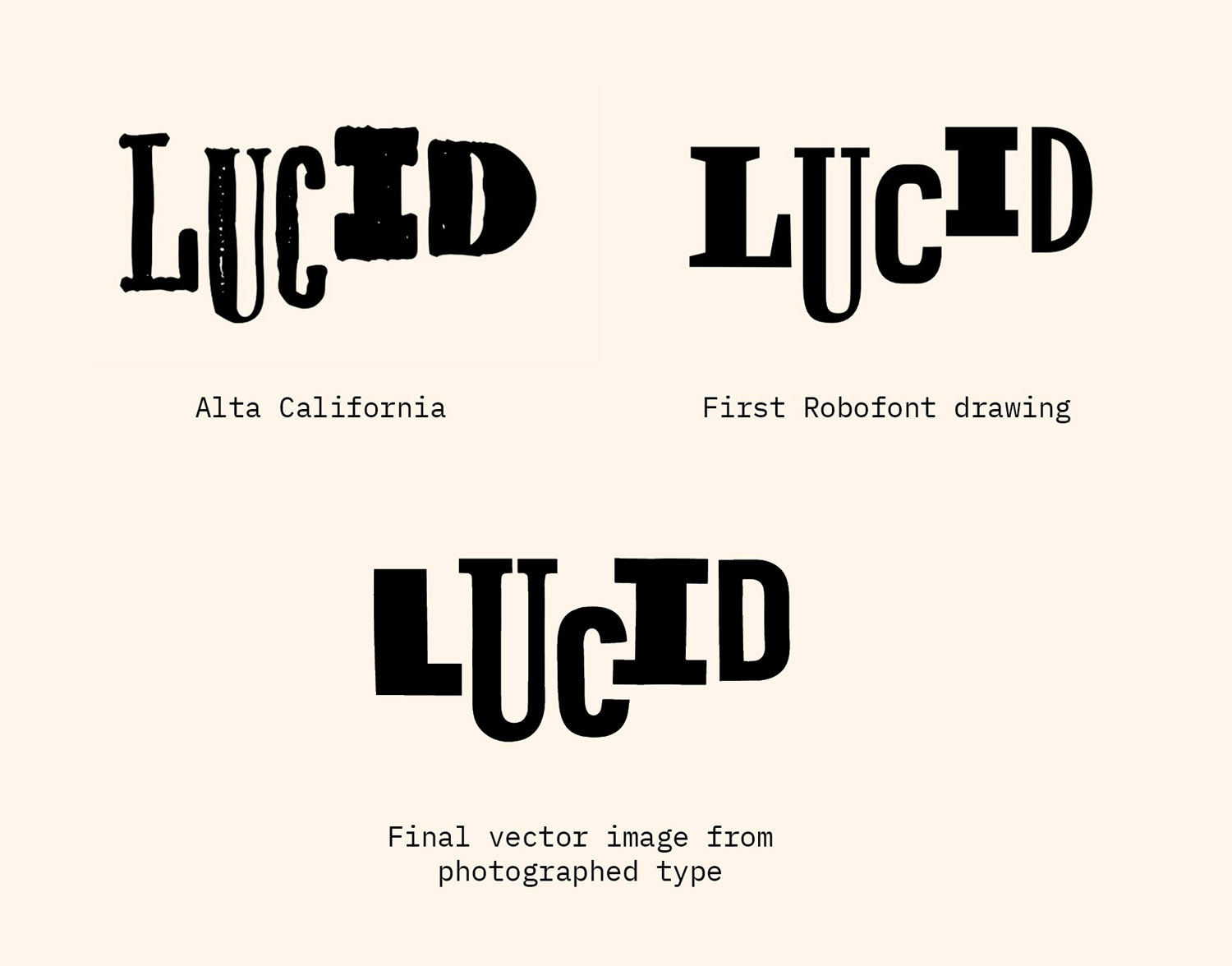
We liked the feel of the mockup using Steve Mehallo’s Alta California the best, so I generated more ideas based on the mismatched/handmade concept of that typeface. I printed out some letters, cut them up, mixed and matched them, and photographed them. I vectorized a few and did some more mixing and matching and rearranging . . .
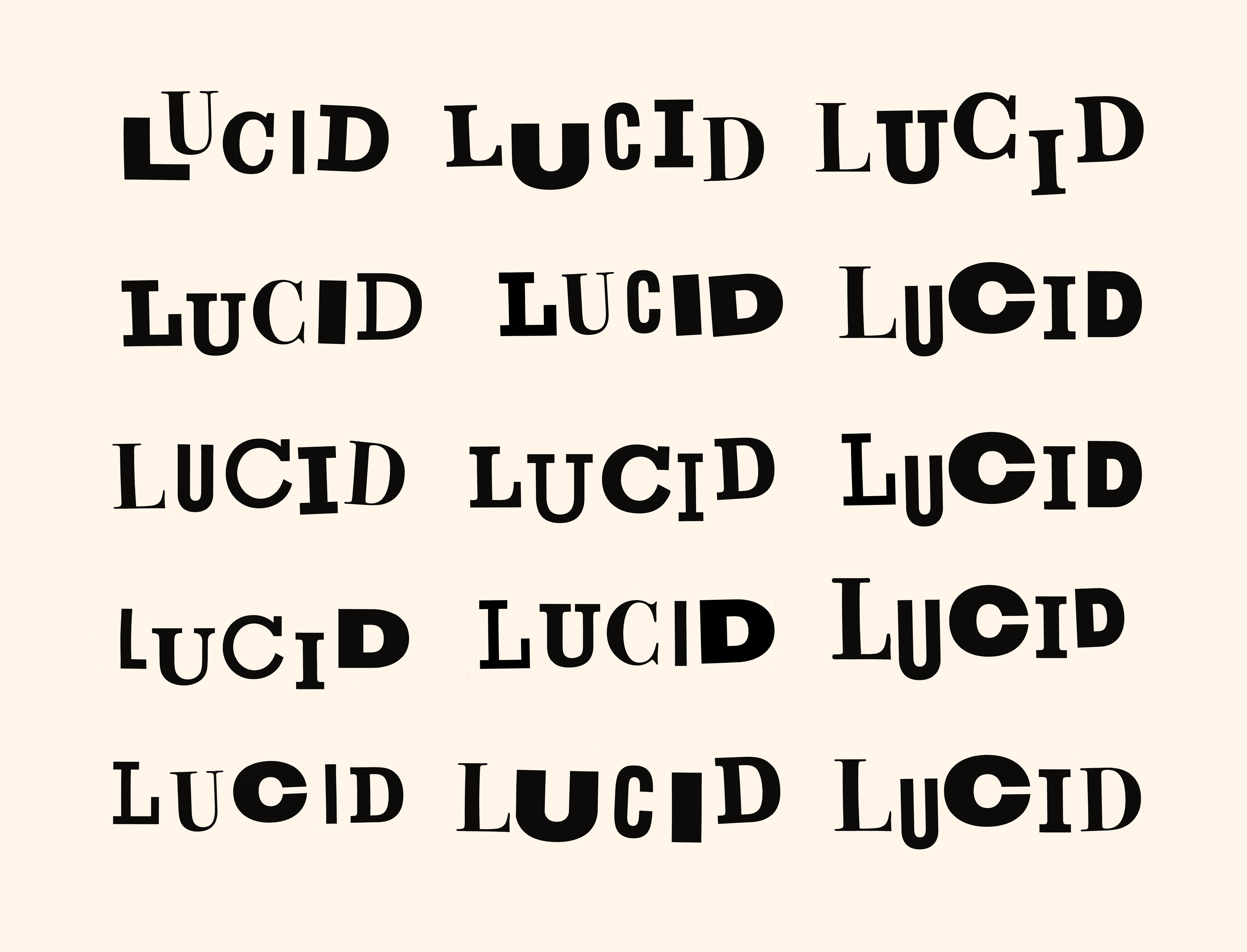
. . . and didn’t end up using any of them! We kept coming back to the proportions and arrangements of the letters as set in Alta California.
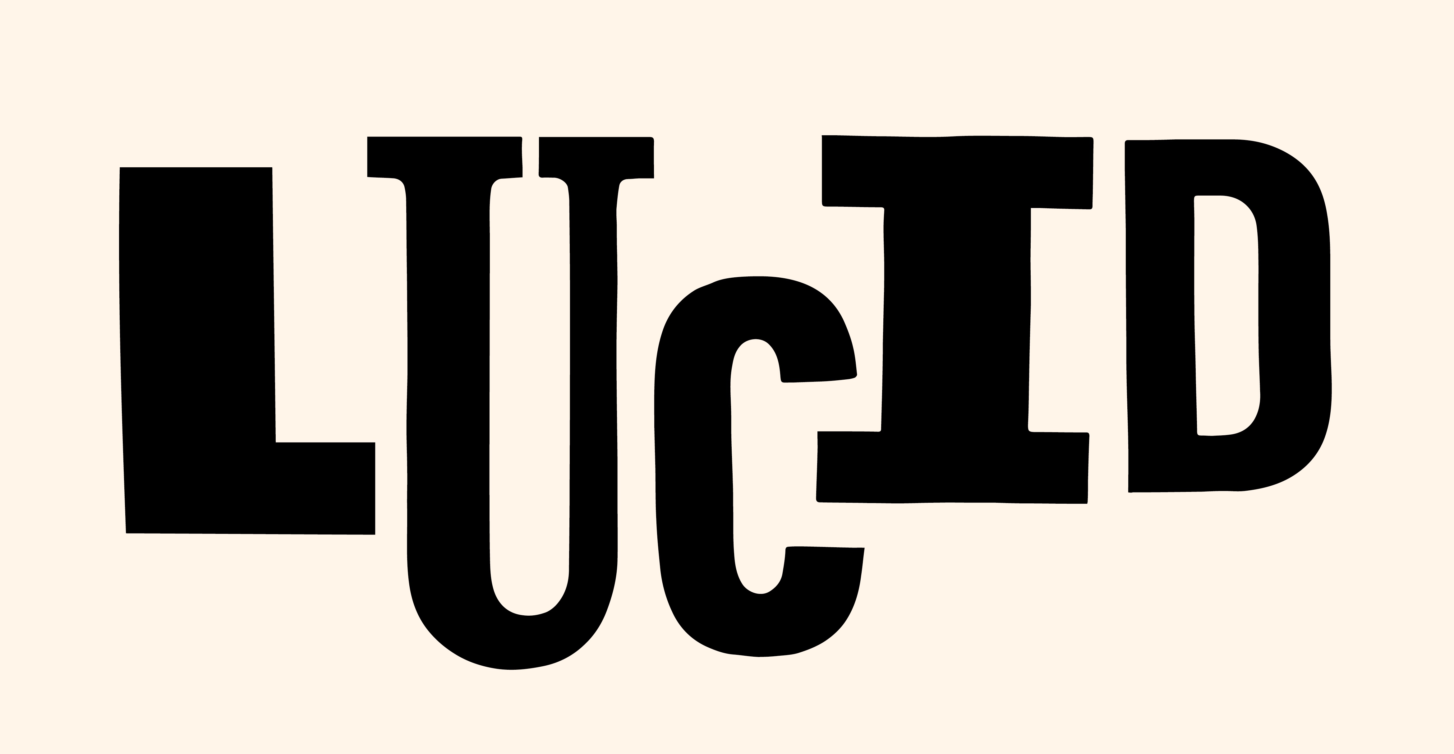
What I liked in the Alta California mockup was the relationship of the L to the tall skinny U, and their position relative to the wider, squatter I and D. I really wanted to preserve the shape of the baseline created by those relationships. I drew a few versions in Robofont . . .
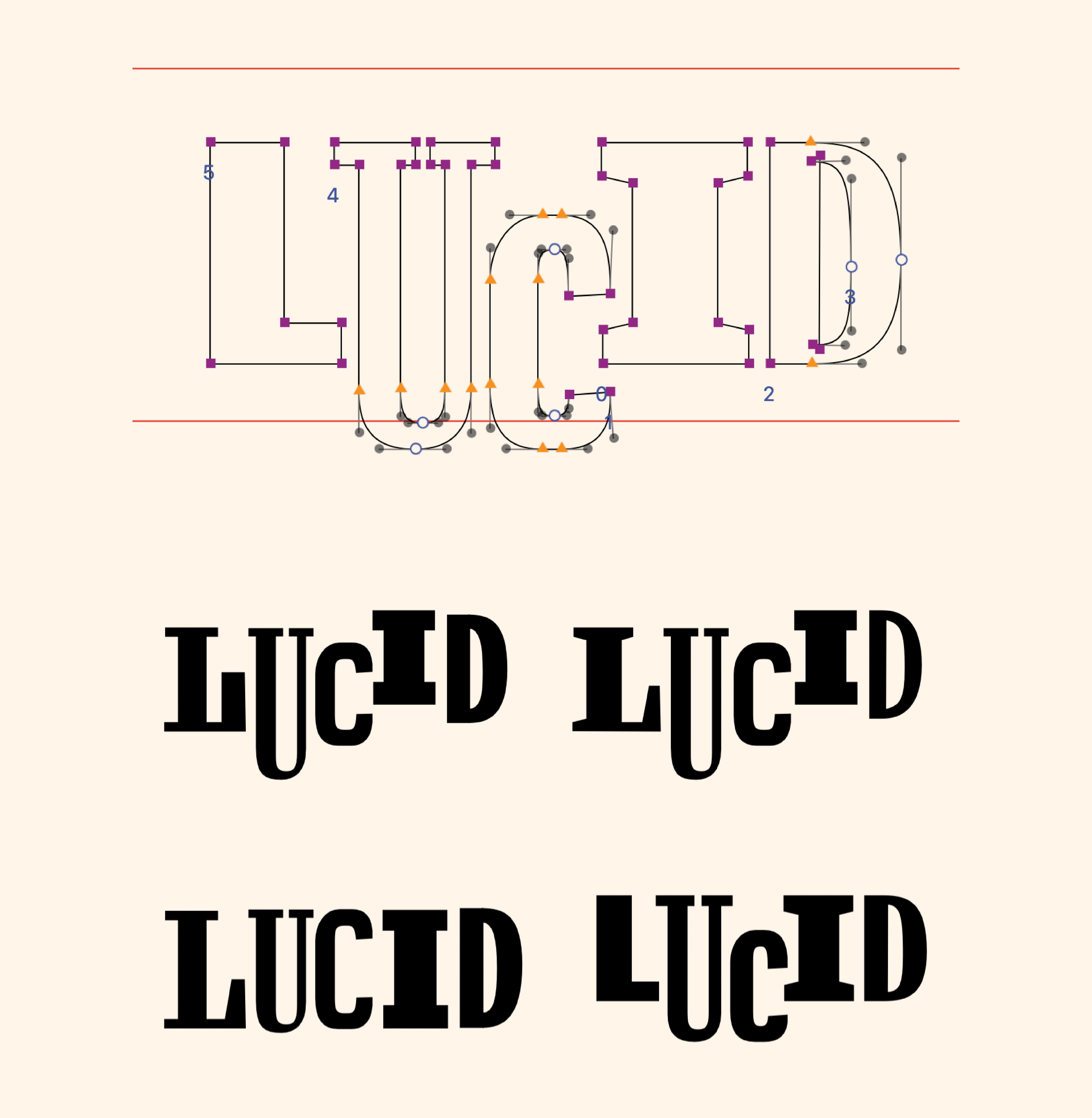
. . . then recreated one of the designs using the photographed printed letters so the type wouldn’t look too mechanical.
The challenge in adapting the Alta California letters was to preserve the uneven weight and spacing (which harkens back to the protest posters) but keep the overall design balanced. The I and D were too heavy; we needed some counterbalancing weight at the beginning of the word, so I drew a new L. To make the logotype read better at small sizes, I reduced the contrast and simplified some of the letterforms.
(To close up some negative space, I made the C dangle off the serif of the I, which we thought was appropriate for a publication full of stories about hanging on by your fingernails.)
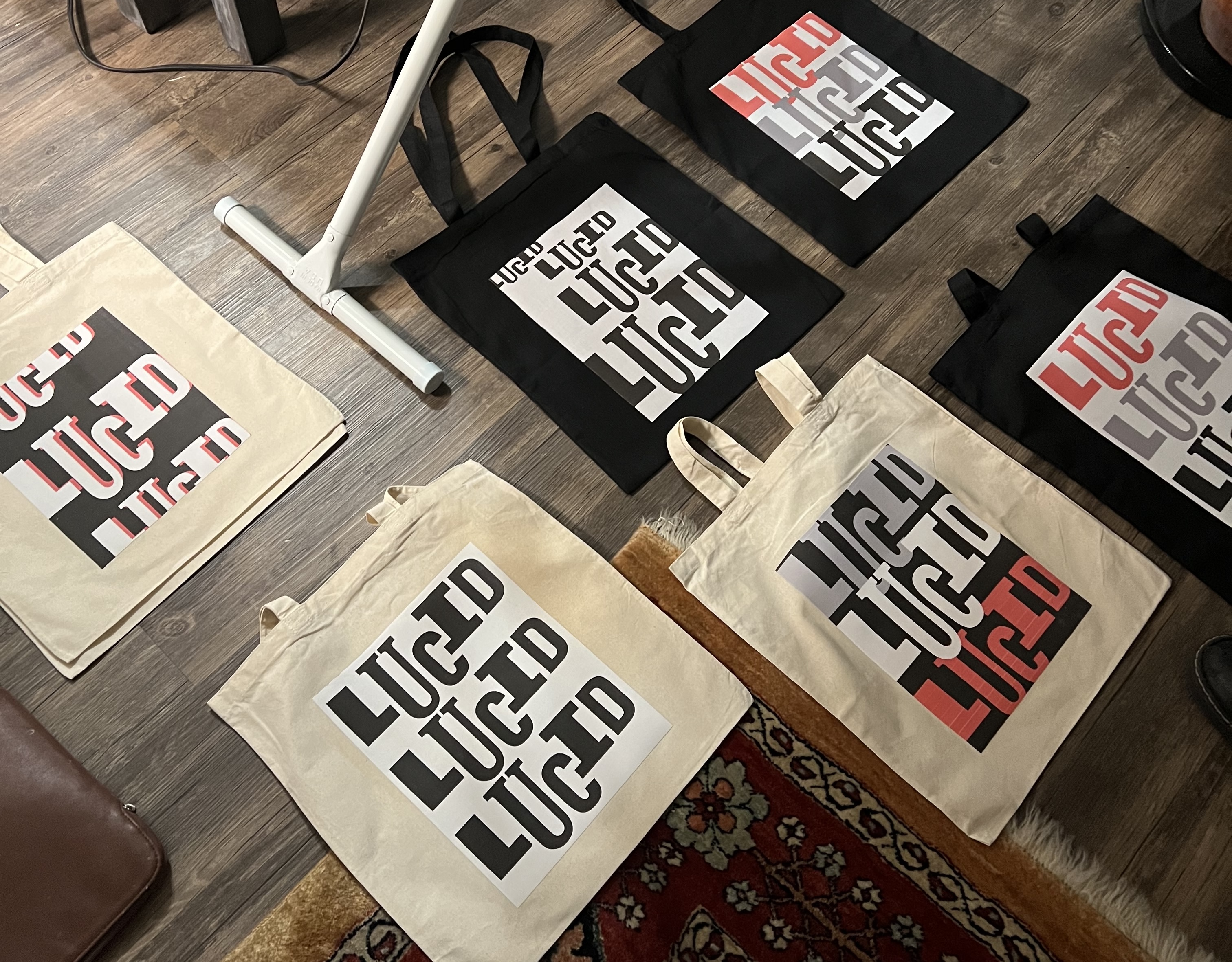
Here are some adorable tote bags designed by Autumn Hoff:
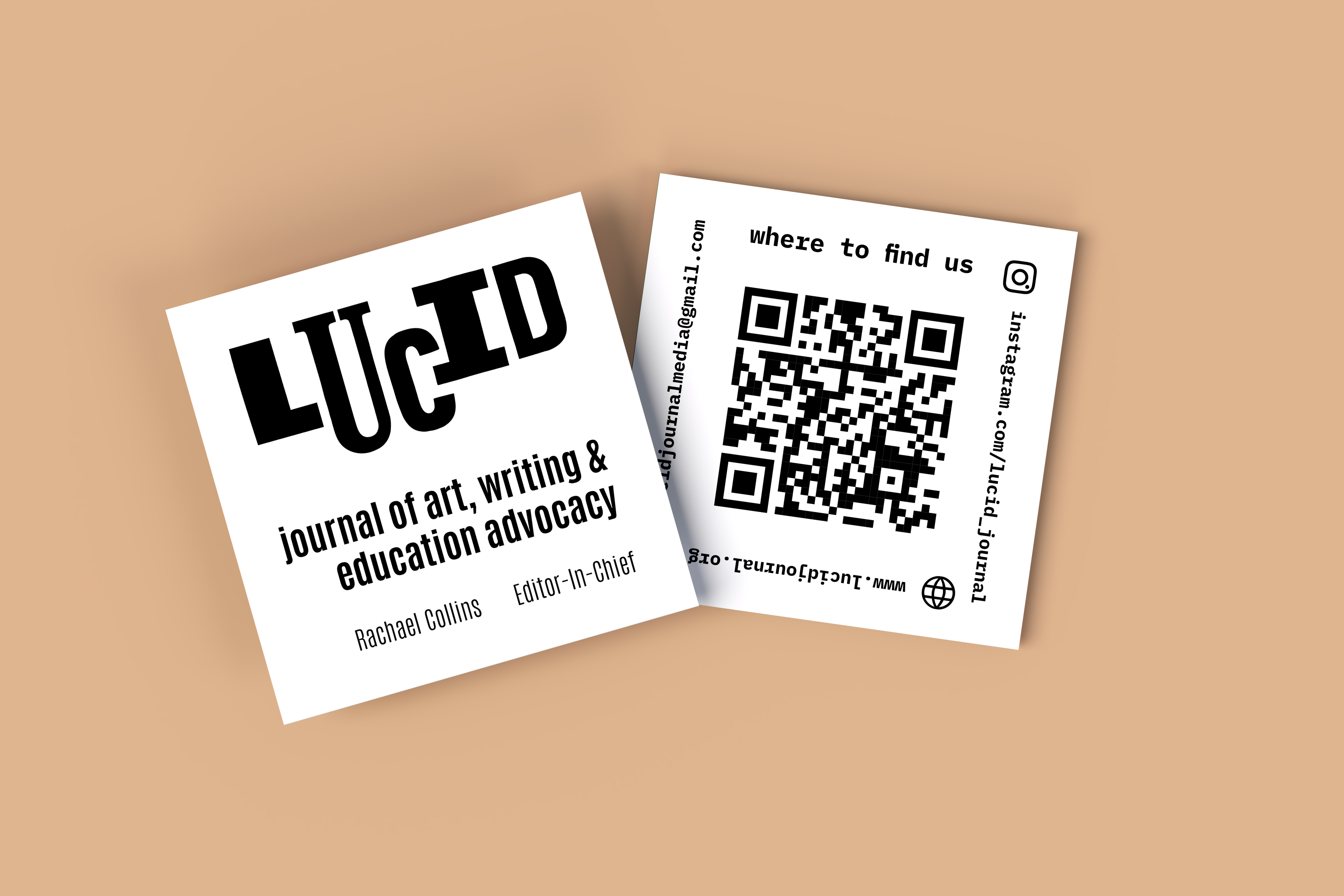
The logo also appears on our new business cards, and of course on our website.